Adding a Clear Icon to the TextField Widget in Flutter
- Joseph Muller III

- Jun 10, 2020
- 3 min read
Updated: Jan 14, 2021
Flutter Newbies Start Here
If you’re new to Flutter development, I’d recommend starting with something a little less involved.
I used this book to learn the Flutter language:
And this one to get started with mobile app development:
…And We’re Off
Receiving and acting on user input is essential to the success of most apps these days. If the experience of typing words into a form field or search bar is frustrating, user’s may be discouraged from using your app. For instance, maybe the input field doesn’t auto-capitalize words even though it should. Or maybe deleting the current value in a form can only be done by hitting the backspace button seventeen times. It’s the little things like this that can send some people over the edge.
In this article, I’m going to focus primarily on adding a conditional clear icon to TextFields in Flutter.
TextFields
The TextField is a widget that can be used to quickly gather user text input. To see it in it’s most basic form, create a new Flutter project and replace the code in main.dart with this:
import 'package:flutter/material.dart';

void main() {
  runApp(MyApp());
}

class MyApp extends StatelessWidget {
  // This widget is the root of your application.
  @override
  Widget build(BuildContext context) {
    return MaterialApp(
      title: 'Flutter TextField',
      theme: ThemeData(
        primarySwatch: Colors.blue,
      ),
      home: MyHomePage(title: 'Flutter TextField Example'),
    );
  }
}

class MyHomePage extends StatefulWidget {
  MyHomePage({Key key, this.title}) : super(key: key);
  final String title;

  @override
  _MyHomePageState createState() => _MyHomePageState();
}

class _MyHomePageState extends State<MyHomePage> {
  @override
  Widget build(BuildContext context) {
    return Scaffold(
      appBar: AppBar(title: Text(widget.title)),
      body: Center(
        child: Column(
          mainAxisAlignment: MainAxisAlignment.center,
          children: <Widget>[
            TextField(),
          ],
        ),
      ),
    );
  }
}

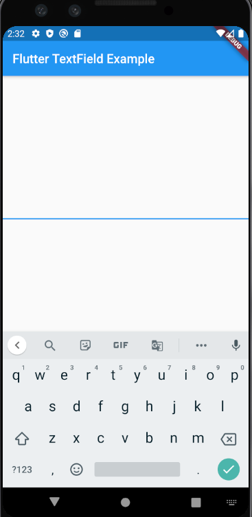
The output is extremely underwhelming…and that’s why this article is necessary.
Adding a Clear Icon
Adding a “clear” icon to the TextField can be achieved using the IconButton Widget. Replace the _MyHomePageState class with the following code:
class _MyHomePageState extends State<MyHomePage> {
  var _controller = TextEditingController();

  @override
  Widget build(BuildContext context) {
    return Scaffold(
      appBar: AppBar(title: Text(widget.title)),
      body: Center(
        child: Column(
          mainAxisAlignment: MainAxisAlignment.center,
          children: <Widget>[
            TextField(
              controller: _controller,
              decoration: InputDecoration(
                suffixIcon: IconButton(
                    icon: Icon(
                      Icons.clear,
                      color: Colors.red,
                    ),
                    splashColor: Colors.redAccent,
                    onPressed: () {
                      _controller.clear();
                    }),
              ),
            ),
          ],
        ),
      ),
    );
  }
}
This code does several things.
Creates a TextEditingController that will be used to actually clear the TextField
Attaches the controller to the TextField
Adds an IconButton widget to the suffixIcon field to the TextField widget
Triggers the controller’s clear() method when the clear icon is pressed

Show the Clear Icon Conditionally
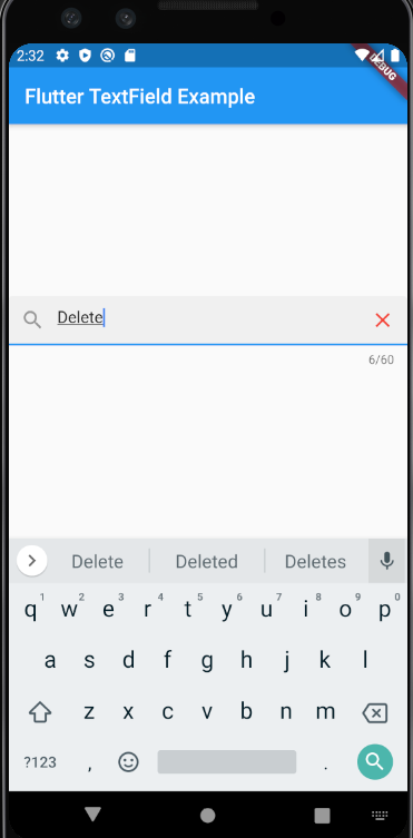
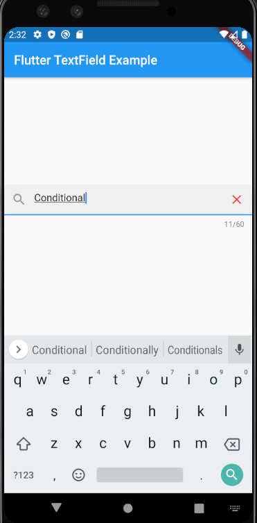
To make things even more intuitive, we can hide the clear icon when the field is blank and show it when there’s actually something to clear. This can be accomplished by conditionally swapping the suffixIcon when the value in the textField changes or when the clear button is pressed.
class _MyHomePageState extends State<MyHomePage> {
  var inputText = "";
  var _controller = TextEditingController();

  @override
  Widget build(BuildContext context) {
    return Scaffold(
      appBar: AppBar(title: Text(widget.title)),
      body: Center(
        child: Column(
          mainAxisAlignment: MainAxisAlignment.center,
          children: <Widget>[
            TextField(
              controller: _controller,
              textInputAction: TextInputAction.search,
              maxLength: 60,
              textCapitalization: TextCapitalization.words,
              onChanged: (text) {
                setState(() {
                  inputText = text;
                });
              },
              decoration: InputDecoration(
                  filled: true,
                  prefixIcon: IconButton(icon: Icon(Icons.search)),
                  suffixIcon: hidingIcon()),
            ),
          ],
        ),
      ),
    );
  }

  Widget hidingIcon() {
    if (inputText.length > 0) {
      return IconButton(
          icon: Icon(
            Icons.clear,
            color: Colors.red,
          ),
          splashColor: Colors.redAccent,
          onPressed: () {
            setState(() {
              _controller.clear();
              inputText = "";
            });
          });
    } else {
      return null;
    }
  }
}


In Conclusion
Adding a button to clear the value in a TextField can make the typing experience feel a lot more finished. Users can quickly delete the things they’ve typed and start fresh. This behavior mimics that of the Material TextInputLayout Views and should be available in all form fields in your app.


Comments